BCG Data Visualisation
Especially for brands like BCG, data visualisation is a cornerstone of presenting insights.
With the growing demand for more engaging data presentation, we worked with the vendor on refreshing the overall look as well as making it more mobile friendly.
Key information:
Project name: BCG DataViz
Date: 2021-2022
Creative Direction: Jan Dudzik
Lead designer: Andre Pires
In numbers:
xxx
Impact:
Global social media
Editorial
Company website
Events (COP26, COP27, WEF Davos)
Vendor: Rare Volume
Brief descriptor:
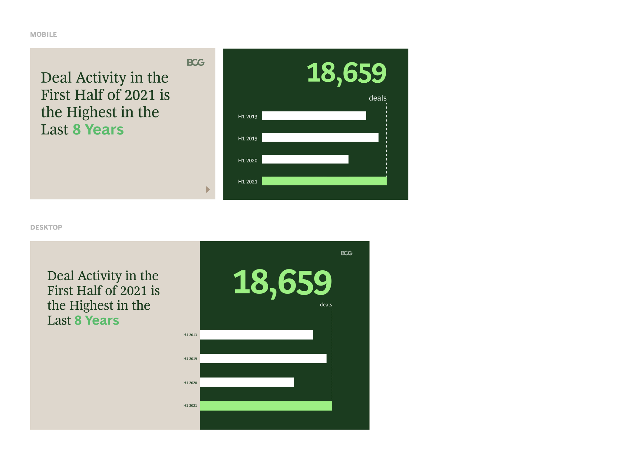
A new set of DataViz templates was created in order to help tell the story in a more visual way and meet the demands of the mobile-first world.
Our DataViz system considers different complexity levels from single data points to very complex tables.
Design system:
Simple but flexible
xxx
Data Visualisation was designed
with three areas in mind:

Bold look
Simplified look which leverages BCG core colors and simple shapes, helps to tell the story in the most pure form.

Tier system to match multiple data sets
Our DataViz system takes into account all kinds of data complexity, from simple, single data point layouts to complex tables.

Social media ready
DataViz options have been built with consideration for social media posts.
In use:
DataViz has been adopted extensively, especially in social media posts.


Want to see some of the work?
There is plenty to choose from:


3D Imagery
Photography and Illustration
Motion Design

Icons
Data Visualisation
Sonic Identity