BCG Imagery
Imagery is an integral part of every brand’s differentiation effort.
With this in mind, we worked on a complete overhaul of the imagery photography and illustration art direction.

Key information:
Project name: BCG Imagery
Date: 2020-2023
Creative Direction: Jan Dudzik
Brand managers: Andre Pires, Luisa Brito, Charlie McGwire
Impact:
Global social media
Editorial
Company website
Events (COP26, COP27, WEF Davos)
Email products
In numbers:
Thousands of photographs
Dozens of custom made illustrations
Vendors:
EyeEm (stock photography), Colagene+ (custom illustration), Agent002 (custom illustration), Pekelo (custom illustration)
Brief descriptor:
Stock photography and illustration are huge avenues of imagery for BCG. Both areas went an overhaul and improvement to the services.
Photography:
Relatable and trustworthy

Three art direction principles
for BCG photography:

1. Human-focused
We are a trustworthy and relatable brand and people are at the center of what we do. It is therefore important for us to show the positive impact of our business on people’s lives and communities.
Our photography shows that we keep a finger on the pulse of society and that we are part of the conversations on topics that matter.
Technically speaking, the photographs should translate a real-life feel: no heavy retouching and/or light tricks (fake glow effects, long exposures at night, heavy filters, staged poses, and situations).

2. Change
Positive change and transformation are what we bring to the world. When possible, we indicate these aspects through different means.
Conceptually: people working, collaborating, learning, achieving change, and transforming their lives and the people around them; people traveling, interacting, playing, and being active.
Aesthetically: People or objects in motion, dynamic, even with a motion blur (while avoiding heavily filtered or retouched photography).

3. Positive
Our positive impact on businesses, society, and the environment is shown in the overall tone of our imagery. We show the world as it is, but also the world as we would like it to be. This ambition, to show positive change, is one of the driving factors in our photography.
OK, but how can I make it look less “stocky”?
Choosing photography.
Tips and techniques:

Think about the perspective
We are objective observers of the working world. This translates into the perspectives we commonly use in photography.
Eye-level:
We treat our clients and one another as equals. This is how we view the world around us; authentically, eye-to-eye, fairly, naturally, and truthfully. This eye-to-eye viewpoint adds to the sense of a relatable brand that you can trust.
Aerial:
Used less often but in line with our "Imaginative" creative driver, we are offering a view from a different perspective. Equally, as objective, an aerial view allows us to “elevate” our observations and impact at scale.

Think about the light
Whenever possible, use natural light or techniques that simulate natural light.
The sincere portrayal of the subject is paramount to creating a positive, trustworthy brand feel.
Avoid light glares and light effects that bring an artificial feel to the image.

Think about genuine look
Clarity or our imagery reinforces the sense of honesty and trustworthiness.
We achieve this through the use of a wide depth of field (which means that a big part of the image is sharp) and by lack of (or very limited) coloring in post-production. This approach creates a natural feel and reinforces the journalism-like style of our photography.
For these reasons please avoid adding artificial blur of any kind, effects, and filters directly to the photography.
Now, for the illustration:

Author: Pawel Mildner


Author: Leonard Dupond

Author: Yukai Du

Author: Leonard Dupond

Author: Leonard Dupond
Author: Pawel Mildner
Illustration:
Making it feel delightful but not ‘cartoonish’.
Principles of art direction for illustration:

Simple
BCG illustration should not be overloaded with too many ideas. Only essential, non-decorative elements should be used to communicate the main idea. Keeping an illustration simple and straightforward ensures clarity. This simplicity of approach helps guide viewers through complex concepts, stories, or scenarios.
Positive & Lighthearted
We bring a positive impact to business, society, and the environment and that should be shown in the overall look and feel of all our imagery, including illustrations.
BCG illustrations should carry a sense of wonder and delight. While illustrations are primarily used to explain or convey meaning, their delivery may be more lighthearted.
Lightheartedness means adding a sense of fun and positivity that isn’t overly humorous, but spirited, charming, and appropriate for the situation, whether in the way characters are drawn and/or in the color usage.
Human-focused
People are at the center of what we do at BCG. We show the impact of our business on people’s lives. BCG Illustration should touch on the pulse of society and business; we are part of the conversation on things that matter.
Visually, our illustrations have humans at the core of the composition, highlighting tender and positive emotions through facial body expressions, color usage, etc.

Change
Change and Transformation are what we bring to the world. We can indicate these aspects through different means.
Conceptually: people working, collaborating, learning, achieving change, and transforming their lives and the people around them. People travel, interact, play, and are active.
Aesthetically: People or objects in motion, dynamic environments, while still maintaining a simple and uncluttered canvas for the illustration not to overtake the layout placement.
We also designated illustration sub-styles to help stakeholders in making informed choices.
Illustration sub-style categories:
Expressive
This style is the preferred illustration style used at BCG and is also the boldest. It uses geometric and organic shapes to create people, objects, shadows, places, and ideas.
It also requires thoughtful application of color and tone to delineate shapes in delightful and interesting ways. Some artists may incorporate grain gradients giving the artwork depth and texture.
Naive
This style is characterized by child-like simplicity of execution and vision that adds a sincere tone to the artwork.
Naive illustrations are characterized by the raw creativity found within the creations of the movement and its uninhibited and instinctive approach to materials, composition, and ideas.
Isometric
The isometric illustration style does a lot of heavy lifting when it comes to communicating rich ideas by using its architectural foundation to express spatial concepts.
Use: This style is usually designated for dense and complex concepts most seen connected with infographics with heavy data.
Geometric
This style uses geometric shapes to convey a meaning, usually abstract. When figurative, the artwork often materializes with bulky shapes that create an object/person.
Use: This style is great to convey more of a conceptual message without being too figurative, giving the reader space to interpret the artwork.
In use:
Illustration came in handy.
A good example of this is pull marketing (subscription email series).
At any given time BCG runs around 10-15 separate subscription-only newsletters (‘email products’). Each series has a theme and its own audience.
In order to build visual recognition, most of them used their own, individual illustration style. Each vendor, tasked with providing illustration is pre-briefed on brand identity elements which helps in building creative consistency over time.


Want to see some of the work?
There is plenty to choose from:


3D Imagery
Photography and Illustration
Motion Design


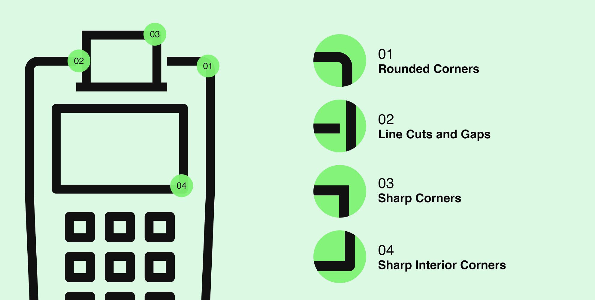
Icons
Data Visualisation
Sonic Identity